Sixt Ride Details
Heuristic evaluation and data-driven design of the last step in Sixt Ride booking funnel.
The Context
At Sixt Ride the team works in a agile way.
Stakeholders bring business cases and the team gathers feedback and data to understand what to do and when.
When discussing about a scrum story, the team goal is to confirm its value as soon as soon as possible. If possible, running A/B testings and user behavior evaluations allow them to learn on the topic.
The Problem
As the team develop and bring many of these tests to production, sometimes, specific screens could have many tests at once.
These tests are great as they allow the team to understand what to keep, improve or discard. Yet, many times these tests are successful and new tests are developed quickly on the same screen.
As so, the user experience is affected as often these tests are thought individually but not cohesively, resulting in clustered screens without clear hierarchy.
The Goal
In this context, Ride Details screen had grown inconsistently. We decided to improve the screen by focusing in the user experience using the available information and without sacrificing features that were already tested and validated.
The Data
Ride’s product owner and I saw different sources of data to understand which would be the best way to design this screen.
We analyzed users’ behavior using Google Analytics and looked over several pieces of information, like how many times they were introducing notes to the driver or requesting child seats.
We also used qualitative data compiled through Hotjar comments, surveys, and user testings to understand the key aspects of this screen.
With all this information we could found patterns that later allow me, as UX designer, to focus on and improve the layout of the screen as well as the different parts of it.
The Insights
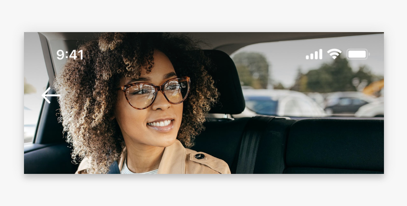
Cover images
We realized that cover images were taking between 36% and 50% of the screen (depending on the device). Through user testing we discovered this was not bringing any value and decided to reduce the dimensions of cover image to up to 18% of the screen.
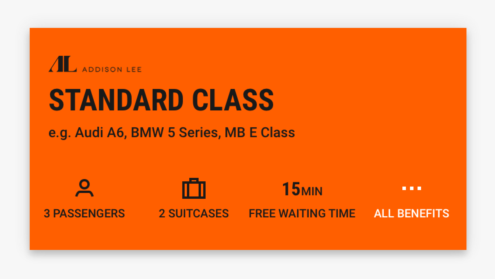
Class Information
In most occasions, users arrive to this screen to understand better what are the perks of each class. Through user testing we discovered that 3 pieces of information were the most important for users: amount of passengers, amount of bags and ride flexibility. We decided to highlight this information and hide all other 7 perks under a button on a separated screen.
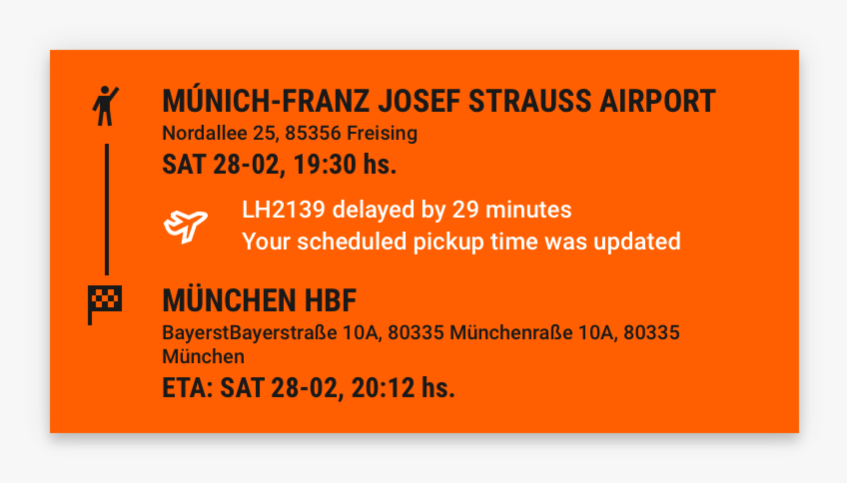
Trip Details
Some users needed confirmation of their trip before booking. As Sixt Ride offers scheduled rides, they wanted to see where they would be picked up and the destination in an easy way.
We planned the information and created a new versatile component in our design system that would adapt to different cases like traveling from a landmark or being picked up after a flight.
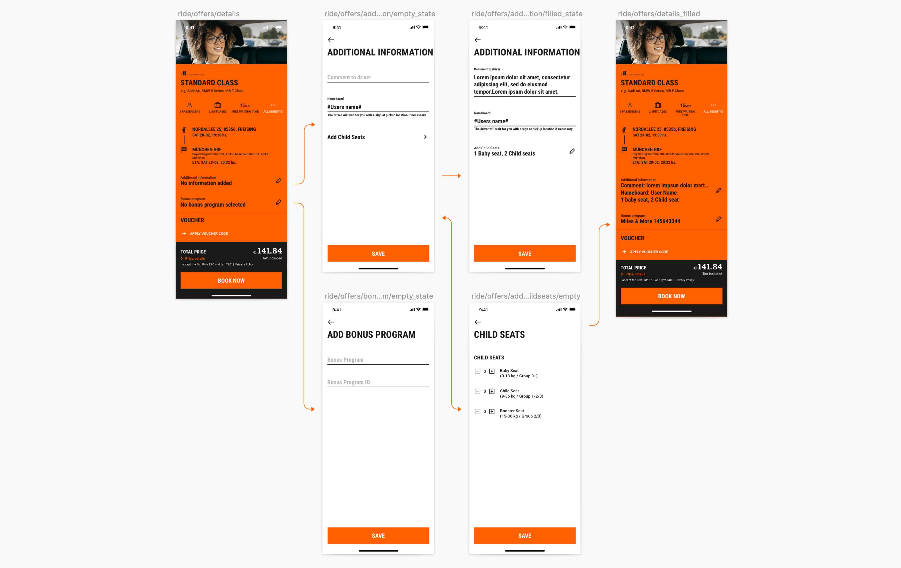
Additional Information
By collecting behavioural data, we understood how likely a user was to customize his trip by adding child seats or leaving comments to the driver. We referred to Sixt Rent user flows to standardize them through the app and created the most logical paths to introduce the required information.
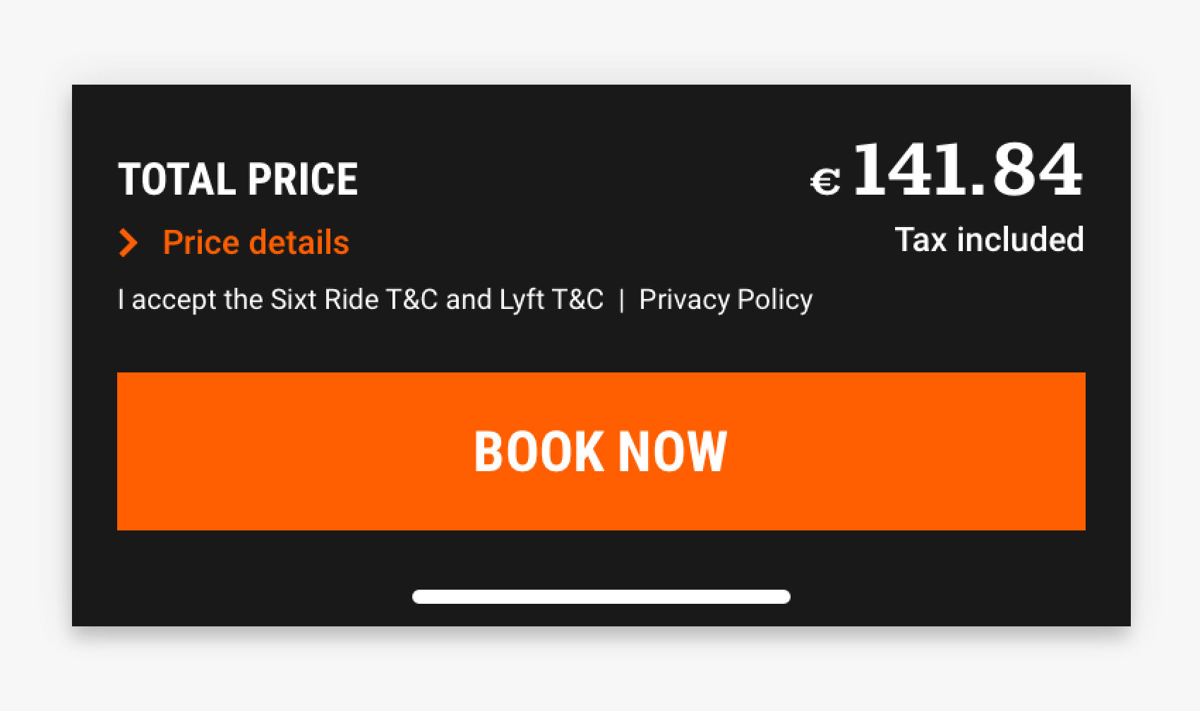
Footer / CTA
Via user testing we saw that the footer was performing mostly well. Yet we decided to run A/B testing to understand if a sticky footer would have more conversion and the results were positive. Thus, we improved text hierarchy, updated the CTA and make the footer sticky in many devices.
The Conclusion
Through data-driven design, we could optimize the screen layout and information boosting user experience and conversion.
The Tools
Understand
- Google Analytics
- Moderated User Testing
- Stakeholder Interviews
- Hotjar
Design
- Paper Wireframing
- Sketch
- Abstract
- Principle for Mac